
Plotting images with world coordinates#
The add_wcs_axes() an
add_manual_wcs_axes() functions of madcubapy
streamline the process of plotting FITS images through the
WCSAxes interface. Both functions accept
MadcubaMap and CCDData objects, and will parse
information from the FITS headers to automatically set axes and colorbar labels.
To add a colorbar to a map, madcubapy offers the
add_colorbar() and
insert_colorbar() functions. These functions are
also explained below.
Using add_wcs_axes()#
This function adds an axis using the projection stored in the wcs attribute
of the map object, returning an WCSAxes
object and AxesImage.
To use this function, we first need to create an empty figure, and pass it as
an argument alongside the MadcubaMap or
CCDData object to plot. The function also accepts additional
arguments that are passed to imshow() such as cmap,
vmin, vmax, norm, and many others.
Under the hood, this function behaves the same way as Matplotlib’s
add_subplot(). After the figure it accepts
three integer values:nrows, ncols, and index. The subplot will take
the index position on a grid with nrows rows and ncols columns, with
index starting at 1 in the upper left corner and increases to the right.
By default, these numbers are each of them 1, this way, if we do not provide
them, the function adds a WCSAxes object
occupying the entire figure size.
Note
If we call this function using the argument names explicitly, there is no
need to pass every function argument.
However, if we are using positional arguments, every parameter must be added
in order
(i.e add_wcs_axes(fig_object, nrows, ncols, index, map_object))
These following statements are all equivalent:
add_wcs_axes(fig=fig_object, nrows=1, ncols=1, index=1, fitsmap=map_object)add_wcs_axes(fig_object, 1, 1, 1, map_object)add_wcs_axes(fig=fig_object, fitsmap=map_object)
Examples#
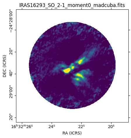
The following code shows how quickly a map can be plotted using madcubapy:
from madcubapy.io import MadcubaMap
from madcubapy.visualization import add_wcs_axes

# Read file
example_file = "examples/data/IRAS16293_SO_2-1_moment0_madcuba.fits"
madcuba_map = MadcubaMap.read(example_file)

# Create empty figure
fig = plt.figure(figsize=(5,5))

# Add the WCS axes object to the figure. # We can pass kwargs to imshow(),
# like 'vmin' and 'vmax'.
ax, img = add_wcs_axes(fig, fitsmap=madcuba_map, vmin=0, vmax=300)

plt.show()
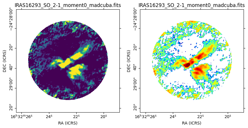
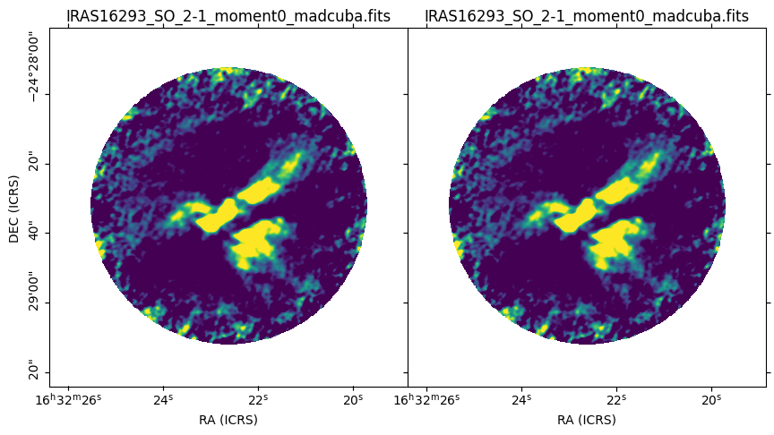
The next code generates a figure with two maps aligned horizontaly. Notice that the nrows and ncols parameters are 1 and 2, respectively. This way we have one row and two columns of images. The third number is the index value, going in order left to right. Here the map on the right (number 2) is using a logarithmic normalization:
from madcubapy.io import MadcubaMap
from madcubapy.visualization import add_wcs_axes

# Read file
example_file = "examples/data/IRAS16293_SO_2-1_moment0_madcuba.fits"
madcuba_map = MadcubaMap.read(example_file)

# Create empty figure
fig = plt.figure(figsize=(10,5))

# Add as many WCS axes objects as desired. We can pass kwargs to imshow()
ax1, img1 = add_wcs_axes(fig, 1, 2, 1, fitsmap=madcuba_map, vmin=0, vmax=100)
ax2, img2 = add_wcs_axes(fig, 1, 2, 2, fitsmap=madcuba_map, cmap='jet',
                         vmin=1, vmax=500, norm='log')

plt.show()
Using add_manual_wcs_axes()#
This is a manual version of the add_wcs_axes()
function. It offers the same functionality with one exception: the
WCSAxes object is placed in a manually
selected position instead of a grid.
The location of the subplot is selected via the figure coordinates of its
lower-left corner, alongside its width and height: left, bottom,
width, height. Their default values are 0, 0, 1, and 1, respectivelly.
Examples#
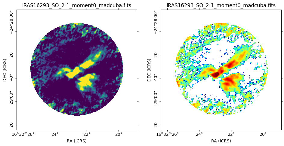
The previous figure can be recreated using
add_manual_wcs_axes() by placing the left subplot
at the left=0, bottom=0 location with a width of ~half the figure (0.4); and the
right subplot at the left=0.5, bottom=0 location with the same width as before.
Note that the widths are less than half of the figure, and 0.05 has been added
to the bottom and left location arguments. This is done to have
sufficient space in the figure to draw the axes ticks and labels, and not have
them cut by the borders.
Also note that the height of the subplots is 1 because the figure size is
already set as 10x5, if we use ~half of the figure height, we would be using
only a height of 2.5 of those 5 available.
from madcubapy.io import MadcubaMap
from madcubapy.visualization import add_manual_wcs_axes

# Read file
example_file = "examples/data/IRAS16293_SO_2-1_moment0_madcuba.fits"
madcuba_map = MadcubaMap.read(example_file)

# Create empty figure
fig = plt.figure(figsize=(10,5))

# Add as many WCS axes objects as desired. We can pass kwargs to imshow()
ax1, img1 = add_manual_wcs_axes(fig, 0.05, 0.05, 0.4, 1, fitsmap=madcuba_map,
                                vmin=0, vmax=100)
ax2, img2 = add_manual_wcs_axes(fig, 0.55, 0.05, 0.4, 1, fitsmap=madcuba_map,
                                cmap='jet', vmin=1, vmax=500, norm='log')

plt.show()
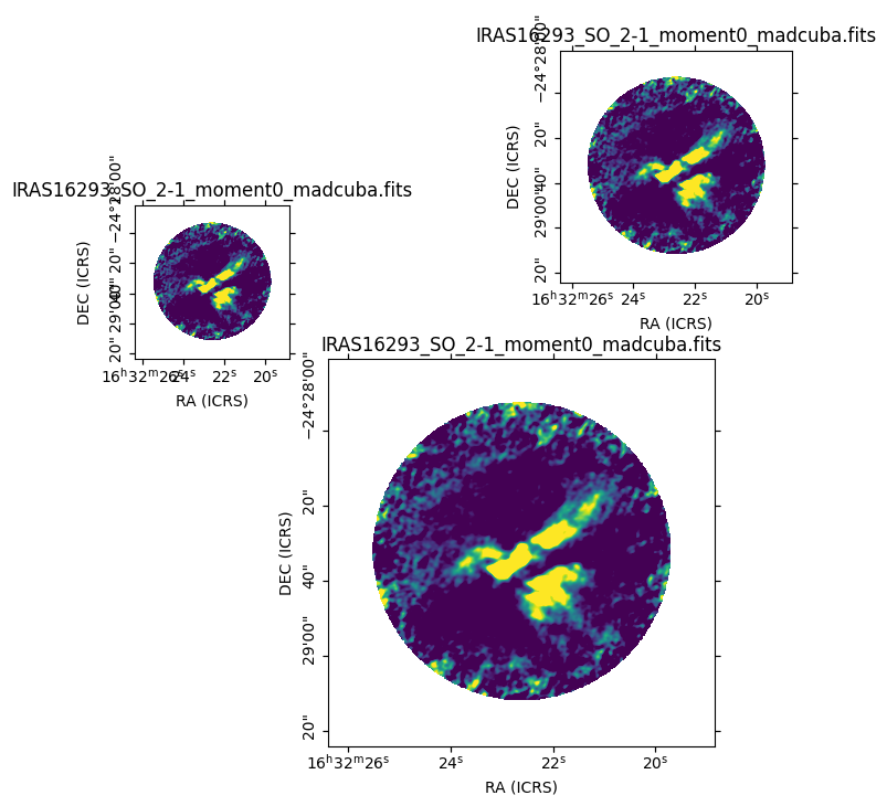
This function allows for all sorts of placings:
from madcubapy.io import MadcubaMap
from madcubapy.visualization import add_manual_wcs_axes

# Read file
example_file = "examples/data/IRAS16293_SO_2-1_moment0_madcuba.fits"
madcuba_map = MadcubaMap.read(example_file)

# Create empty figure
fig = plt.figure(figsize=(7,7))

# Add as many WCS axes objects as desired. We can pass kwargs to imshow()
ax1, img1 = add_manual_wcs_axes(fig, 0.05, 0.55, 0.2, 0.2, fitsmap=madcuba_map,
                                vmin=0, vmax=100)
ax2, img2 = add_manual_wcs_axes(fig, 0.3, 0.05, 0.5, 0.5, fitsmap=madcuba_map,
                                vmin=0, vmax=100)
ax3, img3 = add_manual_wcs_axes(fig, 0.6, 0.65, 0.3, 0.3, fitsmap=madcuba_map,
                                vmin=0, vmax=100)

plt.show()
This is specially useful for sticking two maps right next to the other, by having one start right where the other ends. Note that we need to hide some axis labels to prevent overplotting text.
from madcubapy.io import MadcubaMap
from madcubapy.visualization import add_manual_wcs_axes

# Read file
example_file = "examples/data/IRAS16293_SO_2-1_moment0_madcuba.fits"
madcuba_map = MadcubaMap.read(example_file)

# Create empty figure
fig = plt.figure(figsize=(10,5))

# Add as many WCS axes objects as desired. We can pass kwargs to imshow()
ax1, img1 = add_manual_wcs_axes(fig, 0.05, 0.05, 0.4, 1, fitsmap=madcuba_map,
                                vmin=0, vmax=100)
ax2, img2 = add_manual_wcs_axes(fig, 0.45, 0.05, 0.4, 1, fitsmap=madcuba_map,
                                vmin=0, vmax=100)

# Disable axis label and ticklabels for the right subplot
ax2.coords[1].set_ticklabel_visible(False)
ax2.coords[1].set_axislabel(" ", visible=False)

plt.show()
Add a colorbar to a map#
We can add a colorbar easily to any side of the map by using the
add_colorbar() or
insert_colorbar() functions.
Both functions need the ax parameter, which must be a
WCSAxes object. The position of the colorbar is
controlled by the location argument, which can be ‘top’, ‘right’, ‘bottom’,
or ‘left’ (defaults to ‘right’). The functions also accept additional arguments
that are passed to matplotlib.pyplot.colorbar() to customize the colorbar.
With this we can directly set custom ticks, a custom label, etc.
Usage example:
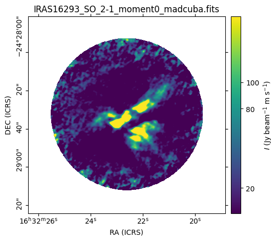
from madcubapy.io import MadcubaMap
from madcubapy.visualization import add_wcs_axes
from madcubapy.visualization import add_colorbar
from madcubapy.visualization import insert_colorbar

example_file = "../../../examples/data/IRAS16293_SO_2-1_moment0_madcuba.fits"
madcuba_map = MadcubaMap.read(example_file)

# Plot map
fig = plt.figure(figsize=(5, 5))
ax, img = add_wcs_axes(fig, 1, 1, 1, fitsmap=madcuba_map, vmin=1, vmax=150)

# Add a colorbar passing a custom ticks argument.
cbar = add_colorbar(ax=ax, ticks=[20, 80, 100]) # Test use ticks kwarg

plt.show()
Placement of the colorbar#
The two functions offer the same functionality but using two different approaches to place the colorbar in a figure.
insert_colorbaradds a colorbar to one side of theWCSAxesobject, which is resized to accomodate the colorbar inside the space it was taking. The colorbar axes will always maintain the width that was set in the beggining, regardless of a change in the map size later (like resizing the window).add_colorbaradds a colorbar at a location relative to theWCSAxes. This version does not resize theWCSAxesand adds the cbar axes right where it is told, overlapping with anything that could be there before. The colorbar maintains the relative width relative to the map if it changes size later.
The following code shows the difference between
add_colorbar() and
insert_colorbar():
from madcubapy.io import MadcubaMap
from madcubapy.visualization import add_wcs_axes
from madcubapy.visualization import add_colorbar
from madcubapy.visualization import insert_colorbar

example_file = "examples/data/IRAS16293_SO_2-1_moment0_madcuba.fits"
madcuba_map = MadcubaMap.read(example_file)

fig = plt.figure(figsize=(15,4))
ax1, img1 = add_wcs_axes(fig, 1, 3, 1, fitsmap=madcuba_map,
                         use_std=True, cmap='jet')
ax2, img2 = add_wcs_axes(fig, 1, 3, 2, fitsmap=madcuba_map,
                         use_std=True, cmap='jet')
ax3, img3 = add_wcs_axes(fig, 1, 3, 3, fitsmap=madcuba_map,
                         use_std=True, cmap='jet')

# Append a colorbar to the top of the axes
cbar2 = insert_colorbar(ax=ax2, location='top', label='custom units')
# Add a colororbar on top of the axces
cbar3 = add_colorbar(ax=ax3, location='top', label='custom units')

plt.show()
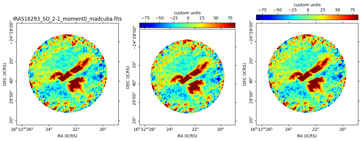
As we can see, the map in the middle (set with insert_colorbar) has been
resized to accomodate the colorbar on top of it using the same space as the
map on the left, while the map on the right (set with add_colorbar)
places the colorbarbar on new space on top of it without resizing the axes.
Automatic unit parsing#
By default both functions parse the units from the
MadcubaMap or CCDData object if found, and
sets the label accordingly.
Due to a limitation in how the functions are coded, only the units of the last
plotted map are correctly tracked. This is intentional to keep the number of
needed arguments as low as possible.
To allow for a correct parsing of the units of every map, the colorbar must be added to a map before the next one is plotted:
# This parses the units of both maps correctly
ax1, img1 = add_wcs_axes(fig, 1, 2, 1, fitsmap=madcuba_map_1)
cbar1 = add_colorbar(ax1)
ax2, img2 = add_wcs_axes(fig, 1, 2, 2, fitsmap=madcuba_map_2)
cbar2 = add_colorbar(ax2)

# This only recognizes the units of madcuba_map_2
ax1, img1 = add_wcs_axes(fig, 1, 2, 1, fitsmap=madcuba_map_1)
ax2, img2 = add_wcs_axes(fig, 1, 2, 2, fitsmap=madcuba_map_2)
cbar1 = add_colorbar(ax1)
cbar2 = add_colorbar(ax2)